Saturday, September 30, 2006

No Flickr: Host your own damn photos!

Quick gripe. Artists/Designers: I don't want go to Flickr! Why am I leaving your site? Host your damn photos on your site, and if you need to socialize 'em, give me a link to your page and I'll peruse if I feel like it. There's no reason, especially if you're a web designer, that I should be leaving your site.

I want to remain in the warm, fuzzy confines of your walled garden.


Technorati Tags: , ,

Labels:

Thursday, September 28, 2006

Blogger troubles

I've been working on getting a sweet corner banner added to my Cycleboredom blog, but Blogger is giving me no love. Problem is that the preview version, and the published version have nothing to do w/ each other. Why would the outcome be different? It's happening on this blog as well; there's not supposed to be much of a margin on the section headers to the right but there is. Except in Safari, but that's another post!

Whatever. No banner. At least I've been able to center the new blog title over there.

This program is pissing me off. I want to build my own.


Technorati Tags: , ,

Labels:

Big Ass Pants: Design Observation

All growed up or dead style?
This is something near and dear to my heart, since I was a part of the Hobo skateboard style of the early 90's. Yes, I said hobo. We were trying to look like shit, and we did a great job of it. In fact I didn't relinquish my big ass style until about a year or two ago. Granted it was more refined, but my pants still were saggin'.

I started thinking about this today after looking over Andy Howell's book Art, Skateboarding and Life. He was largely responsible for bringing urban styled art to skateboarding in general. The New Deal skate company was the nexus for it all. Their graphics, ads, videos, and clothing were all tool of influence. But this is about big ass pants, and they made jeans called "Big Deals". They were huge. They had the ND sun logo on the top of the pocket by your belt which was my favorite thing about them. I had them in grey, and dirty, crap brown. Both of them had no hems on the bottom so the jeans were eternally coming unravelled; extra dirty steelo!

Anyway, seeing kids, and or adults wearing baggy clothing now just seems outdated. I can't figure if it's just me knowing that I have to conform a little and look the part if I want to have a successful career, or are big clothes just plain stupid? Skateboarding has always been on the cutting edge of many style types, but big isn't hot now; tight ass punk rock jeans are in now. Slim styles that I could never imagine myself skating in are normal. Now here I am w/ a pair of fitted jeans in a size 34 where in the past I was looking at 38s'. In fact, these 34s are a little loose!

Here's a little add-on story re: skate clothing sizes. I was "downair en Ballmar" (Baltimore) skating in Fell's Point w/ a couple of my friends and some of the local pros' when celebrity Ballmar skater Bucky Lasek rolls up wearing a pair of light blue jeans, and a nearly fitted white undershirt. We looked at him like he was crazy for not wearing the idiotic clothes we were, but that my friends was a turning point in skate style. W/in a year we were all wearing normal colored blue jeans, white (normal sized) shirts, and my favorite to this day, white skate shoes. Nice, clean and efficient.

I hate getting older. But I have to admit I'm coming around on the mature clothing style. Too bad nothing else is following.


Technorati Tags: , , ,

Labels:

Sunday, September 24, 2006

Daily painters: In a perfect world!

I was doing some gardening over in Technorati trying to get my crops to grow a little when I stumbled onto a blog where a guy made a new years resolution to finish a painting a day for the entire year. On his homepage he had a link to a USAToday article about daily painters. They're doing it and selling them as well!

I'm a huge fan of repetition in most aspects of my life, but in art I think it's invaluable. Depending on how and what you're repeating, that is. Part of the curriculum of my 3rd year at the Corcoran College of Art + Design was something called "80 Works". You're given a list of objectives that are very loose and open to interpretation. If I can find my work from then I'll see if I can find the list and post it. I can't remember the length of time we had to do them, but you had to scramble I can tell you that! It forces you to push boundaries that you otherwise would've never crossed as an artist. When you finish one, you know you have another waiting so that intensity never wanes. Then there's bad repetition...

A couple of years ago I wanted to start pushing my design further, so I came up w/ the idea of "The Daily Vitamin" that goes along the lines of creating something everyday. Unfortunately I was also running the most successful bicycle shop in the Washington, DC Metro area, and that didn't leave much time for my own work. I did get some design work done for them while I was there, but that was about it.

I'm still working on getting back in the swing of creating in the fine art vein, but web design has been added to my future as an artist so I have to push that as well.

I just checked the domains for "the daily vitamin" and "daily vitamin", and they're both taken, but neither of them have content!? Which reminds me I have to transfer my Artboredom domain over to Media Temple from the thieves at Network Solutions. Damn they're expensive. Wish I'd checked that a long time ago.


Technorati Tags: , , ,

Saturday, September 23, 2006

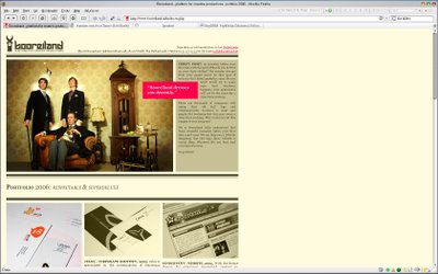
Serve'daGoodSite: Booreiland


Just when you think you're getting a handle on this web design thing you see something like Booreiland. I've been on the Anti-Flash Hunger Force lately, but this is so unobtrusive and different. It reminded me of when I first started searching for cool sites (late 90's), marveling at how they were created.

First off, the main image is sick! I love appropriation combined w/ unexpected utilization; they look like a mod rock band. The tone is set right there: we're rock stars, we'll dress your site right! Then more of their attitude is added by the mission statement/anecdote to the right and the name of their portfolio: RESPECTABLE & SUPERDELUXE. I'm a huge fan of incorporating yourselves into your work as much as possible. There are so many designers/artists/creators out there that are "me too" that personable work stands out. Not everyone likes it, but you have to ask yourself, would you want to work for/with someone that doesn't feel remotely similar? Don't get me wrong, for a crapload of cash I'll stand in line, wear a grey jumpsuit, and look like everyone else!

Navigation through the portfolio is sweet as well. Every image is displayed in a tannish monotone, but when activated, the same image drops down, but in full color. That was completely unexpected. The site is available in both English and Dutch since they're Nederlanders.

The work speaks for itself. Very solid. Take a look at the personal site of Wimer (one of the founders of Booreiland): MONOKAI. He does some ridiculous Flash animation. He also programs a mean beat in the music section.

The clock has to be my favorite part. At first it's the only indication that this isn't just XHTML and CSS. I still wasn't convinced that it was Flash so I had to right-click just to find out. Like I said, unobtrusive.


Technorati Tags: , , , ,

Friday, September 22, 2006

altering Blogger's CSS+XHTML

In the past few months I can say that I've learned a ton about programming XHTML, CSS, and utilizing them w/in strict standards. What I've also learned, is that not everyone is on the same page; or at least they aren't learning the same style. For my own use I separate everything when I'm building a style sheet; I try not to jam multiple properties values under one property. It doesn't make sense to me just yet, so I "spell it out".

Which brings me to my re-working of this blog. Douglas Bowman of Stopdesign knows CSS better than I do. That's why I'm trying to re-work his style, and not my own. Problem is half of the rules he's used have multiple values, and I've yet to figure them out. At this moment, I don't really want to either; I still need to learn things at my own pace. I just Googled
margin:1.5em 0 .75em;
to see what would come up, and a ton of references to Doug's Minima template came up. I'm not sure what that means, but it's pretty strange that it came up on the first page. I also found a template overhaul tutorial done by taoski over at GeekLimit. Nice of him to publish a Blogger tutorial on Wordpress! I honestly can't wait to get off of Blogger, but I still don't have the money to shell out for the Movable Type software.

I think my alterations look fine for the moment, and the background columns line up w/ my new portfolio site's homepage. Not bad so far.

[edit: was just cruising through 9rules and found this post by Jonathan Snook at Snook.ca where in his CSS tips he talks about shorthand for margins. I had a feeling that's what it was, but like I said, I need to learn the long version first. Thanks Jonathan!]

Technorati Tags: , , , ,

Thursday, September 21, 2006

Internet Explorer and web design

add me to the list...
This subject is nothing new, but one that every aspiring web designer must endure: IE flat out sucks! As I've been redesigning my new portfolio site, I've been excited about how it's turning out as well as my understanding of [DIV] boxes; until I previewed it in IE6. At first I didn't want to believe that it was just the browser, and it was my code. As a new programmer you tend to get things working that aren't always semantically correct or universal in use. Thing is you can kinda get away w/ it when you're using Firefox. What, you're not using Firefox?! Have I told you what a lovely browser the Fox truly is?

Anyway it's rapidly becoming apparent that IE is a little slow in reading CSS rules. A simple example would be leaving a [P] tag unaligned. In FF it automatically sends it to the left where IE likes it to be front and center; back into the code we go setting all text-aligns where we want them, just for IE. I don't mind that so much as it forces you to provide clearly defined markup; it's good practice.

the miracle of the box hack and other wonders
Here's where it gets plain stupid. I knew it existed, but I hadn't encountered it yet. IE doesn't display dotted lines. DOTTED LINES!! IE7 is supposed to display them now, but IE6 has been out for an eternity! IE also doesn't recognize the pseudo-class :hover to enable CSS rollovers for class/id attributes either.

The best of all is the legendary "box hack" or hacks that have resulted in IE's miserable display of the box model. You have to trick IE and hide that code from all the other accurate browsers in order to get it to display correctly. What kind of self-serving crap is that? IE wants to do things their own way, but that's usually reserved for a product that someone makes money from, not a free and sometimes mandatory download. Windows is on 90% of the personal computers out there so it's not like MS is hurting for money and that will be supplemented by a deviously written browser. Check this out:
#top {
margin: 0px 0px 0px 0px;
padding: 10px;
border: 0px;
background: #fff;
height: 100px; /* ie5win fudge begins */
voice-family: "\"}\"";
voice-family:inherit;
height: 80px;
}
html>body #top {
height: 80px; /* ie5win fudge ends */
}
I thought I was learning CSS code, not Morse code. I'm not even going to pretend that I understand what kind of voodoo is being crafted here. I can't truly say that though; people had to come up w/ these hacks, and they're leaning the same things I am, so I should as well. Just not today. I want my box to work, and now it does. It's still voodoo.

The code above is from Owen Briggs' site The Noodle Incident. You should check it out; he gives a ton of info on this subject and more. If you want some more fun, just Google "box hack" and see what pops up! Isn't IE wonderful?


Technorati Tags: , , , , , ,

Thursday, September 14, 2006

blog titles: a new hope

As I continue my ascent to reach geek nirvana, I've come to realize that my ambiguous but funny titles are doing me no good in search engines. More importantly it just looks unprofessional, and those using RSS feed readers simply won't pick my posts among all the others out there. I've been avoiding it for a while, but cannot any longer.

Nick over at the Perfomancing blog posted a fantastic writeup on just this issue. I've wanted to be different and show my wit w/ words, and I still can, but I have to get to the point w/in the first couple of words.

BTW, "a new hope" was the full title of the first (1977) Star Wars. I'm so witty.


Technorati Tags: , , ,

Monday, September 11, 2006

you forget something?

I've always had this opinion, but lately it seems to be getting worse. Whenever I see a site that is fixed width and jammed over to the left of the screen I feel like the programmer/designer forgot something. Now I see in my head the rule that needs to be applied to fix it. I know that there are those that intend it, but it really seems like a mistake.

[edit-the last statement applies to non-design sites generally.]

Programming has become a refreshing obsession.

Technorati Tags: , , ,

Sunday, September 10, 2006

quick thought.

I was reading an article on web design from scratch that was on current web styles. He was talking about layout techniques and how left align and full-screen liquid layouts have become less popular. What I thought was interesting was the comment on how we [web users],
"seem to be more comfortable with scrolling, and we're willing to put up with scrolling for the benefits of increased white space and line height."
I completely agree but what provoked this post was the question: why? My immediate reaction was that it was due to changes in hardware. I think that more of us have a mouse that has a scroll-wheel on it, thereby making the centered, longer pages easy to access, rather than moving over to the scrollbar to navigate. Is that the answer, I don't know, but I think it has a lot to do w/it.

I've been working on accessible design lately, but I'm finding that I don't like how liquid design looks in most instances especially on my 20" widescreen LCD (1680x1050). I'm partial to a smaller width site that is accessible from 800x600 resolutions and up. Besides, there has to come a point when you make a cutoff as to who is truly going to view your site. For something like Ebay and Amazon, I see the validity of liquid dexterity for full screen usage. But if you're designing for yourself or a niche market that has been profiled to be net and tech savvy, make the site how you want it to look. Typically those people won't be running super small screens and IE5! That's why a good foundation is needed (user profile, wireframe, etc.) so you can eliminate those headaches early and focus on making da goot chit man!


Technorati Tags: , , ,

Saturday, September 09, 2006

Shout at the [div]el!

Been watching the Lynda.com tutorial for Dreamweaver and it gave me a boost to my already inflating coding ego. Why would you want to use all that crap on the side to work w/ your code? It seems great, and there are some surprising features built in there, but the strength of learning how to create a working page from the ground up is liberating. I started hand coding by using NotePad. Nothing else. When I actually started using DW it almost felt like cheating! The XHTML was highlighted in different colors, the sides were numbered, and the Doctype was already done. When I started typing in my rules and the selection menu popped up I almost crapped myself. This is too easy! So think of coding w/ NotePad like swinging a weighted bat in the on-deck circle before stepping up to the plate. Once you take the weights off the bat feels super light; same w/ using DW.

What I've been working on lately is repeatedly coding new pages from scratch so I can build up some habits. I'm also pushing hard to learn to create different
box styles. I've recreated some that I've seen but mostly I'm trying to do things that I haven't seen yet. I'm struggling deciding on resolution compatibilities vs. design intent. I like the idea of liquid sites, but I haven't seen a reason for it yet. Everything I've wanted to produce would be destroyed being resized by a smaller resolution. They'd have to have a pretty small screen though; the largest I've done has been 800px wide. That'll be accessible to a variety of screen types.

That's not nearly the struggle that aligning these bastards has been. The descriptions that the W3C gives for relative, absolute, and the rest almost border on philosophy. I have yet to wrap my brain around them. So I've been searching for those that have created something very similar, and seeing how they resolved the issues. I've found a range of hacks that force things to happen like centering, but there's still something missing. Perhaps I'm putting too much thought into it. I can say that I can hand code a page in tables in a freakishly fast time. I feel like I have a better amount of control w/ tables at the moment, but that's because they're easier to code compared to divs. They are ridiculously messy too. Looks like crap on the screen.

I can't believe how fast I've turned into a CSS code snob/aficionado. I would've laughed at myself a couple of months ago before I started drinking the "standards Kool-Aid", hearing myself talk about how code looks. It makes total sense though. The faster the load, the better the mood the user has while visiting your site. You can see how a JavaScript laden site continues loading while the content is present on the screen. My site for example has rollover effects w/in the body for my gallery; sometimes I've found myself freaking out thinking the links are broken because things don't immediately display correctly.

I can't freakin' wait to get the time to redesign my portfolio site; it's sort of embarrassing now. I like my art, but there's too much that I want to change for it to stay much longer.


Technorati Tags: , , , , , , ,

Friday, September 01, 2006

making changes.

I've been having some flashes of unadulterated inspiration lately. My net travels have taken me through the domains of Ruby on Rails and Drupal as I've been searching for the latest web tech. I'm hatching a plan to take Cycleboredom and Artboredom to the next level. I think that Artboredom will simply be an extension of the portfolio site, but just as important. The site that could take off is Cycleboredom. I need to put together a proposal so I can bring in some potential backers and participants to the soup. I want it to go farther than talking about my training and gripes during my rides. I'm a product guy and I need to promote that.

So the thought is I HAVE to get off of Blogger and move to appropriately Movable Type or roll my own. I've been using Media Temple as my provider (who are awesome by the way!) and they offer MT as an upgradable portion of their service. That would allow me to use my server space and have a dedicated domain. Having someone type in blogspot after the blog name is just ridiculous and far from professional. The other option is to install Drupal onto my server and utilize their tools to build my own site from the ground up. Drupal does most of the hard stuff regarding databases so I wouldn't have to touch PHP or MySQL just yet. I haven't finished CSS yet, so why do I want to mess w/ that crap.

If anyone out there is reading, and by the stats you're not, let me know what your experiences or preferences are. I'm going to keep researching this, but I want to act on this ASAP.

Technorati Tags: , , , , , , ,

caught hand coding in the bathroom!

This past week has been nothing but me, countless pots of coffee, and Dreamweaver shacked up at my desk force feed learning CSS as fast as I can. Altering existing code inside of Blogger only allows you to see what it can do, not what I can do. Starting code by hand from the start shows you there is a ton to learn. I have to say that the pages I've written so far have NOT used tables at all. I've been on the DIV tip all the way brah! I've obviously been peeking at other's codes to see how they've solved issues, but for the most part I'm creating all my styles by hand and memory. I still can't believe that I've gotten this far since I started the Web Design courses in February!

As for the portfolio site, I've already aquired enough knowledge to start coding it in CSS rather than butcher it in ImageReady. As a style builder and an image optimizer it's a great tool, but as a coding tool for your screen image it's a disaster. If you've been to the site, clear your cache and visit again. Watch how long everything loads; you can see it reading the code from top to bottom. WAAAY too much JavaScript used for things that can be easily done in CSS. Take for instance the works pages and the hover effect that I've used. There is JavaScript written for and with every one of those images telling the computer to do something 'onmouseover'.

In CSS you create a class that can be recalled by every image but loaded just once, and CACHED for the rest of the site using that class! The stylesheet loads one time, and is called upon throughout the site w/out affecting any loadtimes. Granted once the JavaScript is loaded, the site works pretty well, but we're talking about new page hits, and not just w/ my portfolio site.

All this talk about load times, standards, and lite/minimal code is for all the sites we'd produce for customers. Think about how many times you've been to a site and your mood starts to change to irritation as you wait for the content to appear. It's the same thing as walking into a store and having a bad experience or being ignored. Your mood affects your choices and that is a major concern for all trade/commerce sites.

NOW I know why those who code in CSS and XHTML standards promote the issue so much, it's a major accomplishment to do so! The best way to check out CSS sites is to find a gallery. I found one that aggregates most of them for you! CSS Galleries is up to 175 pages so have fun. I haven't been through all of them, but it's not like I didn't try.


Technorati Tags: , , , , , ,